Client
Boulder Walls

Overview
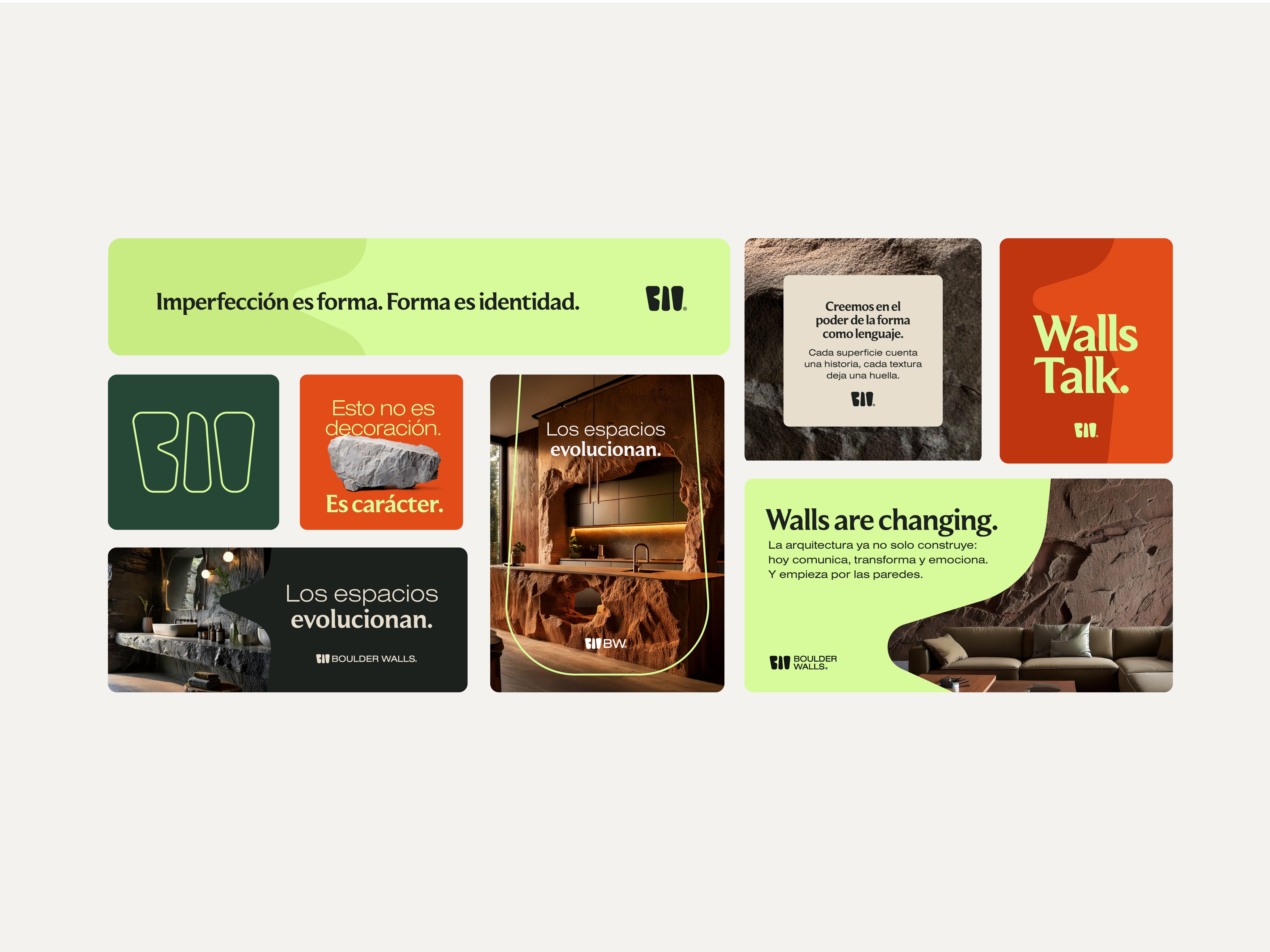
The branding project aimed to position BoulderWalls as the pioneer of a new niche: naturalistic wall thematization through custom, eco-conscious stone structures. The challenge was to express the brand’s unique fusion of technology and craftsmanship, while appealing to architects, interior designers, and end clients alike. The result is a refined yet grounded identity system, led by a symbol that evokes stacked boulders and a color palette that anchors the brand in nature.
Client
Boulder Walls
Industry
Interior Design
Service
Branding
Digital Design
Duration
5 Weeks


The Challenge
In a market saturated with modular, industrial-style wall finishes, BoulderWalls needed to stand out as artisanal, bespoke, and sustainable. It had to shift perception, transforming stone structures from cold and decorative to warm, emotional, and deeply human. The brand also had to build trust through a clean, professional image that communicated its high-end execution and deep respect for nature.

The Solution
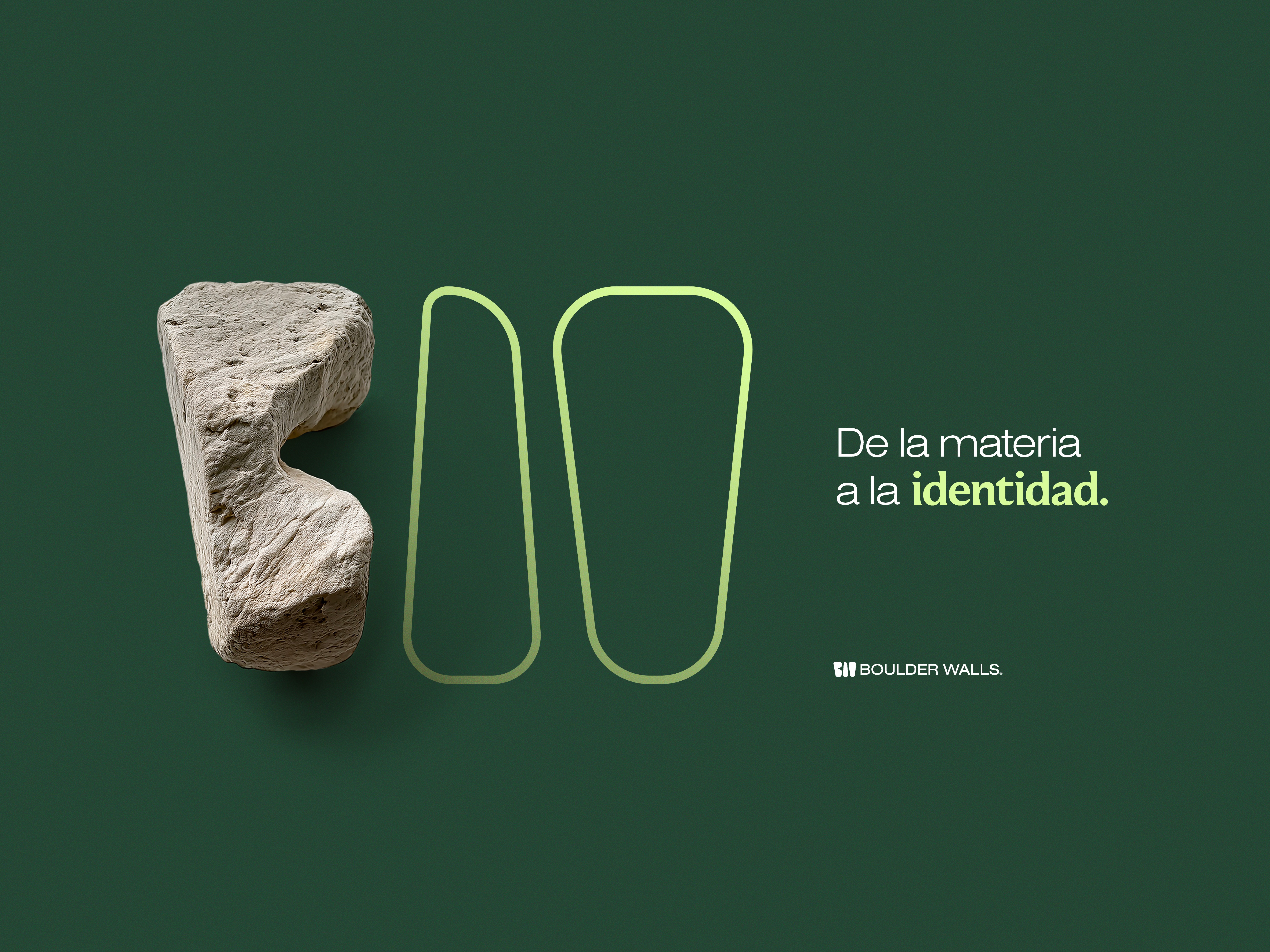
The logomark became the centerpiece of the brand: an abstract composition of irregular, organic forms subtly forming the initials B and W, reminiscent of stacked stones. This metaphor reflects stability, authenticity, and handcrafted beauty—mirroring the brand’s design philosophy. The deep green tone grounds the identity in nature, while geometric typography introduces precision and balance. The full visual system bridges artisanal feeling with architectural clarity, setting a distinctive, lasting tone.
The Result
The new identity helped BoulderWalls launch as a credible, memorable, and emotionally resonant brand. It speaks equally to collaborators in architecture and end users seeking natural connection through design. The visual language, centered around craft, imperfection, and grounded beauty, now gives the brand a solid foundation to grow, differentiate, and lead in a space where emotion, innovation, and sustainability meet.


PORTFOLIO

Soosh!
Soosh!
Soosh!
Branding
Packaging
White Paper

Edison
Edison
Edison
Brand Identity
Digital Design
Social Media