Client
Edison

Overview
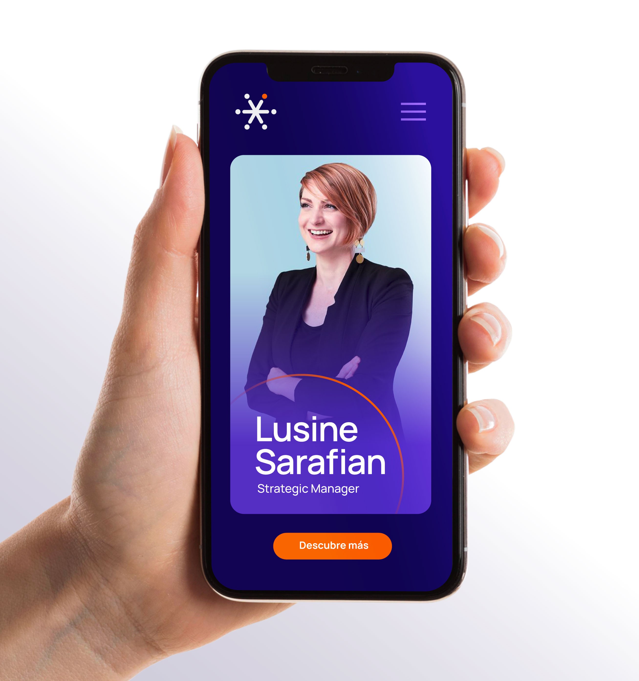
The project focused on refining the existing logo and developing a broader visual system to strengthen Edison’s brand identity. The color palette was expanded, and new typefaces were introduced, creating a cohesive and modern look that aligns with the platform’s mission of providing practical, career-boosting courses for professionals.
Client
Edison
Industry
E-learning
Service
Brand Identity
Digital Design
Social Media
Duration
5 Weeks


The Challenge
Edison needed to stand out in the highly competitive online education market. The brand had to communicate professionalism and innovation while appealing to professionals seeking advanced training. Additionally, the visual identity needed to be flexible and scalable, ensuring consistency across different subject areas and content formats while maintaining a strong and recognizable aesthetic.

The Solution
The logo was refined to achieve a more modern and polished look while maintaining brand recognition. A comprehensive visual system was developed, including complementary graphic elements and an expanded color palette that adds versatility and energy. New typefaces were carefully selected to balance readability with a contemporary aesthetic, ensuring clear and engaging communication across all platforms.

The Result
The brand refresh resulted in a more cohesive and professional visual identity that resonates with Edison’s target audience. The new design system enables greater flexibility in marketing and educational materials, supporting course expansion and attracting top-tier instructors from leading companies. (somosedison.com) The enhanced brand consistency has strengthened Edison’s market recognition, helping to grow its student community and position it as a leading platform for professional education.


PORTFOLIO

Soosh!
Soosh!
Soosh!
Branding
Packaging
White Paper
Branding
Digital Design